Apple Music Unveils New Logo Crafted Directly from Sound Waves
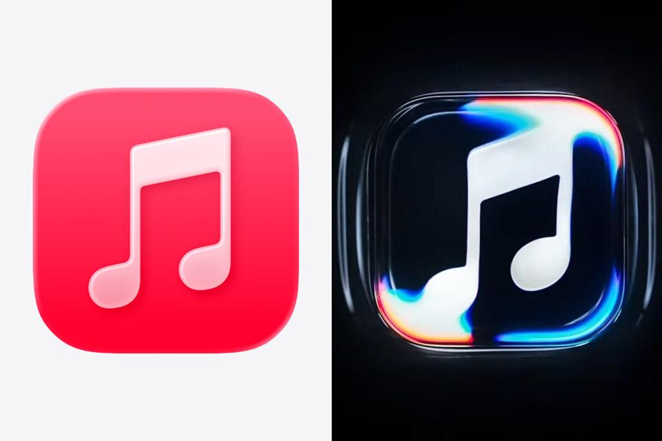
Apple Music introduced its updated brand identity on October 21, 2026, built around the idea that sound itself should generate the visuals. British producer Fred Again and the sound design studio NEST Acoustics created a short original composition that serves as both a sonic signature and the source material for the new look. That piece runs through a transducer, a device that turns an audio signal into physical vibration, placed inside a shallow tank of mineral oil.
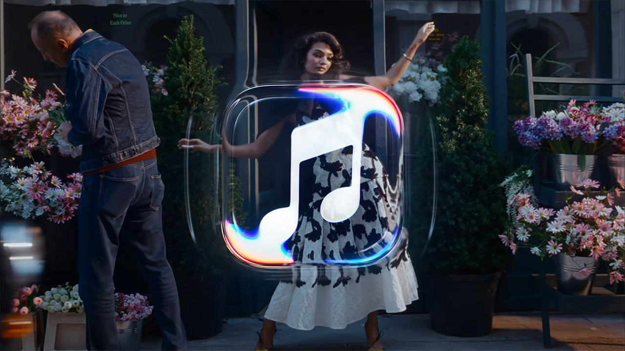
An Apple Music emblem was carved into the tank’s glass floor before pouring in the oil. A transparent cover designed like an Apple app icon sat above the logo on a turntable, so that when the music played, the transducer sent waves out, causing the logo to twist and bend in real time. There was no clever computer trickery to improve it because everything was captured on camera as it happened. Apple has taken the same low-key approach in some of their recent Apple TV rebranding efforts.
Sale

soundcore by Anker Q20i Hybrid Active Noise Cancelling Headphones, Black | Over-Ear, Bluetooth, 40H ANC…
- Hybrid Active Noise Cancelling: 2 internal and 2 external mics work in tandem to detect external noise and effectively reduce up to 90% of it, no…
- Immerse Yourself in Detailed Audio: The noise cancelling headphones have oversized 40mm dynamic drivers that produce detailed sound and thumping beats…
- 40-Hour Long Battery Life and Fast Charging: With 40 hours of battery life with ANC on and 60 hours in normal mode, you can commute in peace with your…
The footage from those sessions was used to create the logo that appears in the short intro at the beginning of Apple Music videos and live performances. There are two versions: one with the entire wordmark and one with just the musical notes. The ripples capture the light and make the logo appear to be moving, similar to the Liquid Glass interface language used in Apple products today.

The wordmark itself pairs the familiar Apple symbol with a heavier, tightly spaced lowercase “music” set in a customized version of SF Pro. The letters sit denser and wider than the previous title-case treatment, giving the name a more compact presence on screens and in advertising. The app icon was changed from the old red one to a black and white design that toggles between bright and dark mode, as several individuals had conflicting feelings about it online. They think it’s less distinctive than the old red one.
TBWA\Media Arts Lab handled the overall identity work alongside the music collaborators. Signs of the shift first surfaced in September with materials for Apple Music Hall, the new London venue, before the same wordmark showed up in software betas. Full rollout across apps, websites, and original programming begins this week, with the complete set of updates expected in the public releases of iOS 27.2, macOS 27.2, and related systems next week.
Apple Music Unveils New Logo Crafted Directly from Sound Waves
#Apple #Music #Unveils #Logo #Crafted #Sound #Waves